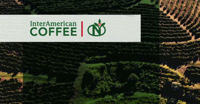
Without question, 2019 has been an enormous year of growth, reflection and change at InterAmerican Coffee — and the big announcements just keep on coming. We’re excited to share that, for the first time in nearly four decades, we have a new logo!
Lots of intentional decisions went into this decision, and we thought we’d share a bit of our reasoning for the change.
First, the world, of course, is changing. Our old, very long and horizontal logo was created in a print world; decades later, it was struggling to fit inside the digital world. Literally. On media such as event posters, our name would end up quite tiny, just to fit in the box.
Second, we’re enormously proud to be a Neumann Kaffee Gruppe (NKG) company, and breaking from the visual template shared by the 47 other NKG companies was a bit of an existential, as much as visual, challenge. Specialty coffee, consumers and the business-to-business world are changing. While B2B companies have been safely tucked behind the idea that what they look like doesn’t matter, that’s simply no longer true. We increasingly felt the need to be visually linked to our heritage and family, while also able, as a brand, to stand on our own.
And third, social media demands the use of symbols and reduces brands to elements. To address this, we’ve made increasing use of the Neumann N. But as our sister companies work to grow their global and social presence, and we increasingly work to highlight them and the benefits of our relationships, the N is less a symbol of InterAmerican and more clearly a symbol of the Neumann Gruppe.
Considering all this, and working in cooperation with InterAmerican Coffee Europe, we ultimately developed not just a logo but a design system.
We combined the Neumann serif font with a more-modern sanserif font; stacked our name to halve its length; embraced the Neumann N; and incorporated a red bar as a repeatable element.
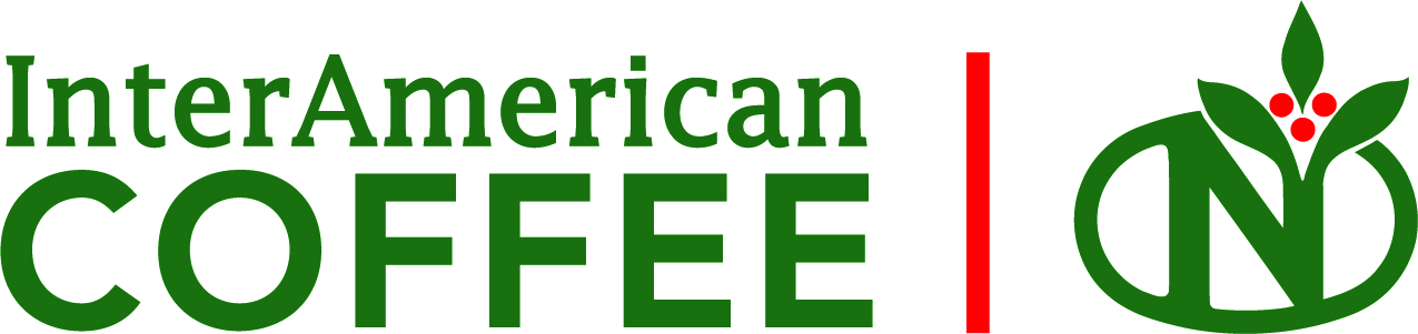
We now have a primary logo (above) with meaningful, flexible parts. On social media, the red bar will become an underscore to the N — with time, we hope that when you see the N paired with the red bar, you’ll associate it with InterAmerican.
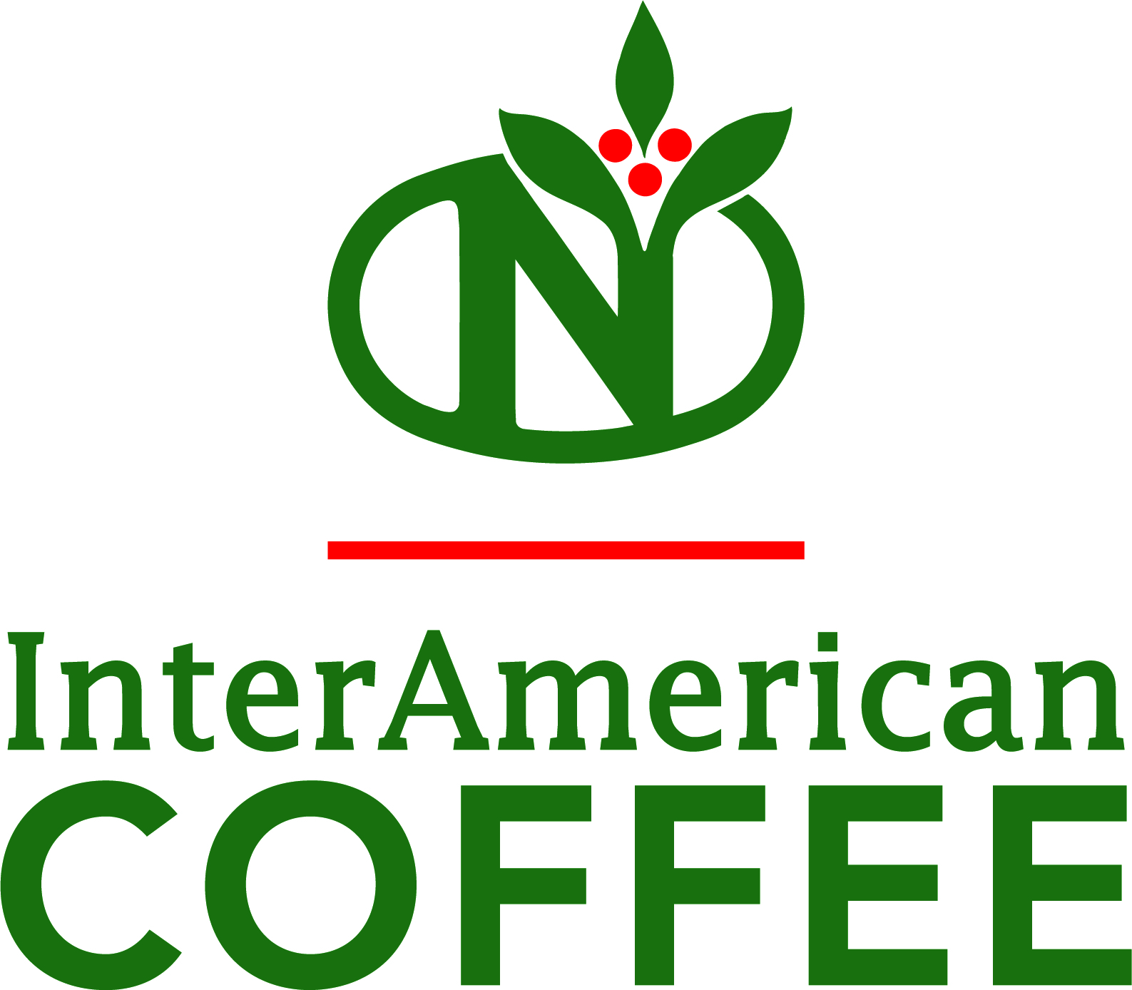
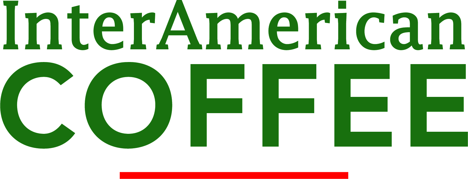
When we need to fit in a square, the elements stack up for a bold impact. (Bring it, event posters!) And in cases where we need to slim down, the N can be left off and the bar slides under the wordmark (the word part of a logo).
![]()
And while we really do believe that all you lovely customers like working with brands that take care to look professional and you can visually relate to, we also know that’s only true when we’re also doing our jobs beautifully.
So, with that, back to work we go! •